Posts

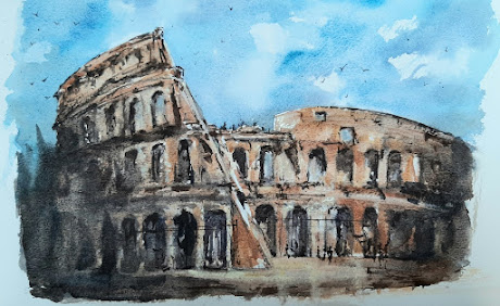
The Coliseum part two!
Image
This is my second attempt for my class, the first was do e in preparation for my notes for the students.  I enjoyed painting this one more than the first, I took my time sketching and then applied the colours in the manner of the artist I have used for this image. The method for the sky and the clouds sets a dramatic scene, the use of warm colours for the structure help to portray its ancinet nature.  I intedn to revist this style of painting but with images of ancient Rome with y own interpreation.  I am not sure that the students in the class enjoyed this as much as I did!
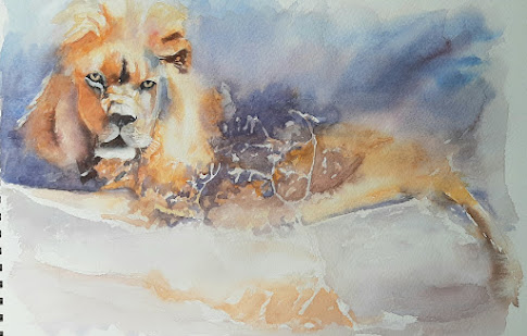
Lion in the light

Image
This was the task for today. It has taken me 3 hours to get to this stage. There is more work to do to bring it more to life.  The artist Dylan Pearce is brilliant and his use of water with colour is awesome.  As I said this image us just the first stage. Having a few days break between the initial start of this task and then given time to observing the painting I have made more alterations.  Sometimes in a class situation there is not a lot of time for this; that is why I say to all lerners to take time to either finish off at home or try again with a chance to observe between prosesses without rushing.

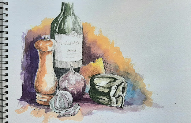
Still life a joy to create

Image
This demo was done at a centre this week, and it is inspired from a great artist Paul Weaver.  The style is something I love and I tend to gravitate towards many times.  This image took 2.5 hours and the process was very relaxing and comfortable, nothing too difficult here.  The use of dipping ink and pen is more sketchy and loose.  It helps to make your apporach more open and relaxed and less technical. I actually like all forms of pen and ink and I find images like this a foundation to get used to and master this medium.    

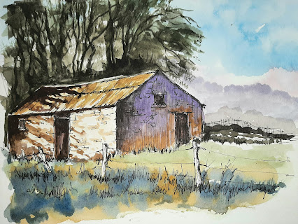
An old country barn

Image
  This painting was part of one of my classes.  It was inspired by an artist Paul Weaver (who paints some great pen and wash paintings.)  This image below was my tutorial example for the handout I created for my class.  This was an A4 size watercolour pad.  I took my time and had no distractions when preparing the task. This example here was demonstrated in class (21/9/22) and was on an A3 watercolour pad, I really tried to enjoy the expereince.  But with a demo I stopped and started frequently, looking at and guiding the learners. Given more time in class I would have added more vibrant colours and give it a bit more contrast.  But doing a painting more than once will never deliver the same results, each is unique to the time of painting it.  Despite the venue and situation of painting, I really find pen and wash one of my favouite styes of art.

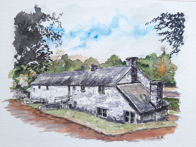
Wollen Mill - St Fagan's

Image
This is a simple approach to drawing this building in ink and watercolour washes.  I love visiting St Fagan's Museum of Welsh culture and this building is just one of many.  I drew this as a task for one of my classes and is not meant to be too realistic as in hyper realistic.  It is a watercolour sketch and as such requires a fluid apporach.  I used Daniel Smith paint and I used bottled ink.  I painted this on 200lb watercolour paper trying to used both sides of the sheet in the art pad (waste not want not). I find using pen and ink a good way to capture scenes quickly and with a style that I like very much. There is a link here to the history of the Building.  wollen Mill

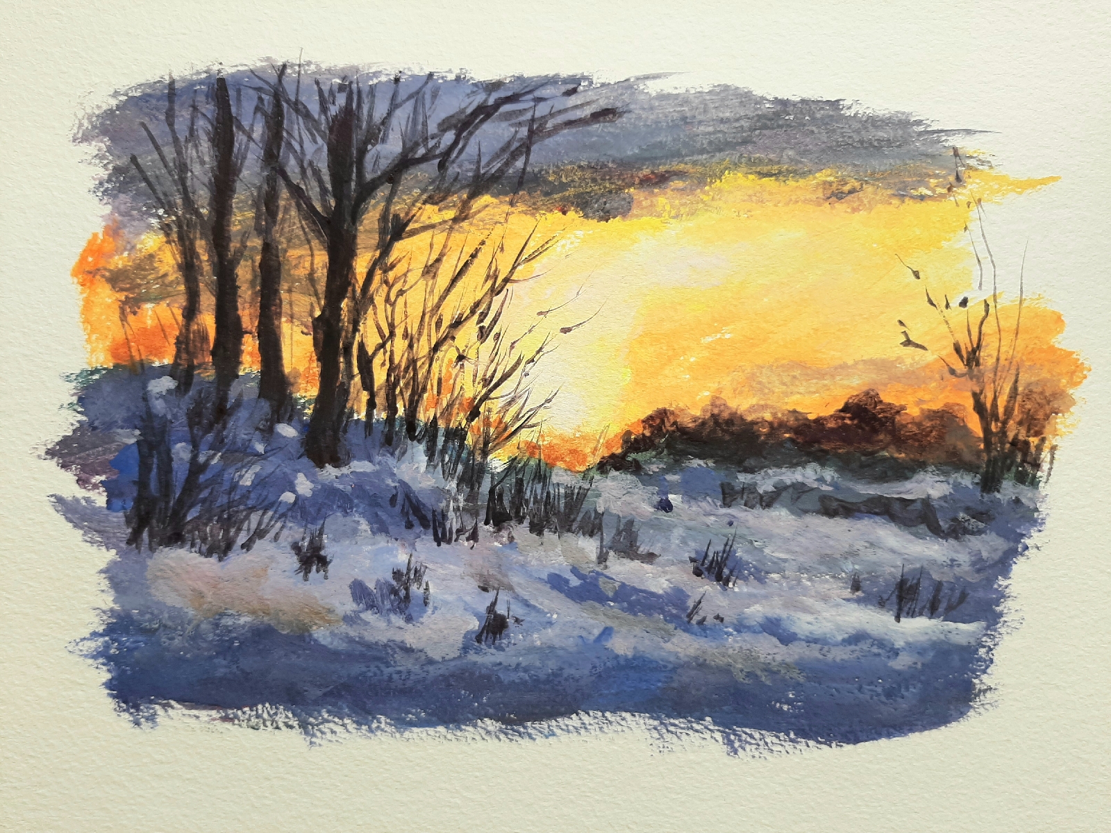
winter scene in gouache

Image
This was to be a short experiment to continue in the same material as the Ludlow painting, gouache. This was inspired by a demonstration by Robert Brindley, which was featured in an Artist magazine. I am quite surprised how versatile gouache is. It dries quickly but mixes well. This example was on 200lb watercolour paper. I have been using both sides of a sheet not to waste paper! Adding more details with trees and twigs. Adding more sky and foreground tones. I used white, yellow and orange tones. Next, sticking just straight on the paper and build up the layers of gouache. This us a free and relaxing approach.

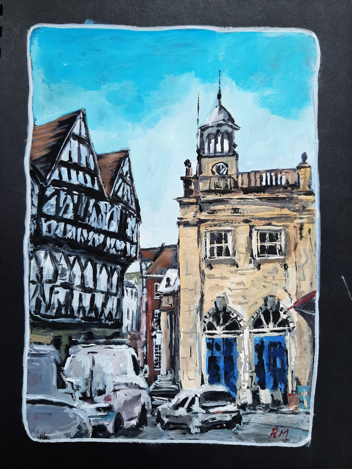
Ludlow Town

Image
Having visited Ludlow, last month, this little painting was used to explore using Gouache paint. I used A4 black paper, white pastel pencil sketch and used some cheap paints to paint this scene. It is impressionistic and drawn free hand.  Realising that the white gouache was not opaque enough I used Designer's white gouache paint, which was what I needed, more opaque and mixed well with the other paints.  As this is an experiment, I am quite pleased with the result, I hope to use gouache more in my pure watercolour efforts. Below are some screen shots of the process used: I used black paper and drew outline in white pastel pencil.

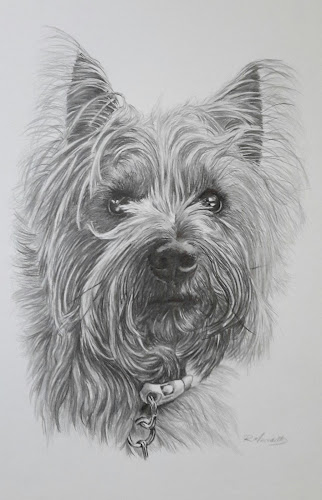
Portrait of Pepper

Image
This is an old drawing I was asked to draw for a student's daughter as a birthday gift.  I think I did this in 2017.  I wanted to add to this blog to show how involved something like this is. This was in fact my second attempt as the first one was done by scribing the paper and added graphite to make the hair more realistic, but after spending a week on it still was not right, so this then became a pure graphite attempt, and I was very plased with the likness. I used various pencil grades and I also used an fine pen eraser to create the effect of the lighter fur.  I realy focused on the eys as this is where the likeness really mattered.